
When your current and prospective supporters want to learn more about your nonprofit’s mission and impact, they’ll likely turn to your website as a main information source. Your website is more than just a core part of your nonprofit’s marketing strategy—it’s also a key tool for driving donations, registering supporters for events and volunteer opportunities, or otherwise encouraging them to engage with your organization.
According to Loop, the best nonprofit websites go above and beyond communicating helpful information for their audiences. They also provide a streamlined, intuitive user experience (UX). When supporters can find what they’re looking for quickly and easily, your nonprofit can reap maximum benefits from your website.
A major part of ensuring the best possible UX on your organization’s website is testing the navigation. When conducting a navigation test, make sure to examine these five elements:
Providing a positive user experience will allow supporters to engage with your organization more effectively and encourage them to return to your website over time. Let’s look at each aspect of intuitive navigation in more detail.
1. Site Hierarchy
The first navigational aspect you’ll need to consider when designing your website is how the pages will generally be organized. The site’s hierarchy should incorporate all essential pages yet be simple enough that users can find the information they’re looking for quickly.
A best practice in web design is to leverage outside input when creating your site hierarchy. Work with volunteers to determine how they would intuitively organize the site and incorporate their feedback into your design.
To get started, ask your volunteers to complete one or both of these tests:
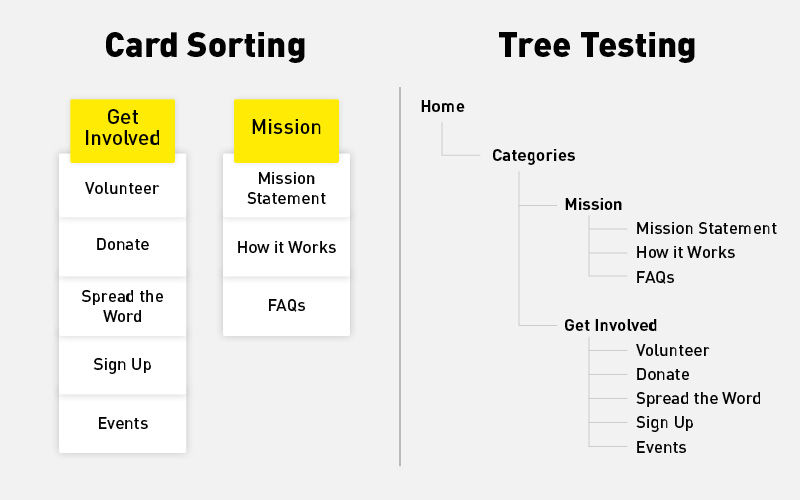
- Card sorting: Depending on how large you want your website to be, choose anywhere from 40 to 80 topics that you’re planning to include. Write them down on index cards or sticky notes (either physical or digital), then ask your volunteers to group topics together that they think are related and give each group of cards a title.
- Tree testing: Lay out some categories and subcategories of information in a spreadsheet, then transfer the hierarchy into a digital tree testing tool. Give volunteers a list of information and have them document how they would navigate to it through the tree.
After your tests, ask volunteers for feedback. They may have ideas for pages you could add, delete, rename, or regroup to make site navigation easier. When you know how outside audiences react to your plans, you can design your website with your user in mind.
2. Menu Categories
Once you have a general idea of what your site hierarchy will look like, it’s time to finalize the main categories in your navigation menu. Your navigation bar will appear at the top of each page on your website and will allow users to jump from one page that interests them to another, so you’ll want to make it as streamlined as possible.
A few important considerations regarding the navigation menu include:
- Number of categories. A shorter navigation bar is simpler to use (and more aesthetically pleasing), so stick to four to seven main categories.
- Title length. Keep the title of each category to three words or less so it’s as easy to read and click on as possible (for example, a category titled “Our Work” is much more straightforward than “How We Impact Our Community”).
- Categories vs. CTAs. Any topic that has subcategories in your site hierarchy should definitely be included as a main navigation category. But if you want to highlight a page that doesn’t require subcategories and asks users to take an action, format it as a call-to-action (CTA) button instead. For example, many nonprofits include a link to their donation page as a button at the top of each page instead of a menu item to make it stand out.
The exact categories you include in your navigation will depend on your nonprofit’s goals and the results of your hierarchy tests. However, many nonprofit websites include some combination of these categories:
- Homepage (sometimes listed as “Home” and sometimes linked to the organization’s logo in the navigation bar)
- About Us/Our Mission
- Our Work/What We Do
- Resources/News
- Contact Us
- Get Involved
Your donation page is possibly the most important element of your website, so make sure it stands out in your website . As you conduct usability tests with volunteers, you’ll be able to determine whether you should include it as a separate CTA in the navigation bar or add it as the first subcategory under “Get Involved” and add a few CTA buttons on other key pages to make sure users can donate quickly and easily.
3. Functionality
Functionality is typically the main element organizations focus on in a website navigation test. In this context, functionality refers to how easily a user can access the information they’re seeking and take desired actions.
The web design layout you choose will influence functionality, as a responsive website will be easier for users to navigate than a static one. But even if your layout tends to set up a positive UX, you’ll need to conduct tests to ensure the design choices you’ve made within that layout work for real-life supporter engagement.
To test functionality, you’ll go through a similar process to tree testing, although you’ll be using a fully built-out version of your website instead of just the site hierarchy. Give volunteers a number of tasks to complete using your site navigation bar, such as:
- Locating your mission statement.
- Learning the names of key staff members.
- Viewing a media element related to your work, like a video or infographic.
- Downloading a resource.
- Finding the date of an upcoming event.
- Filling out your online donation form and contact form.
During this test, you’ll want to track not only whether your volunteers are able to complete these tasks, but also how long it takes them to navigate to each relevant page. Then, you can make adjustments to your navigation bar based on the results.
For example, if the event date takes several volunteers several long minutes to find, you may want to feature your Events page or organization calendar more prominently to ensure supporters know when events are happening. This will ensure the resources you provide are as helpful as possible to supporters.
4. Accessibility
A good nonprofit website should prioritize accessibility, as accessible design allows any user to engage with your website effectively. Your website navigation bar is especially important to design for accessibility since audience members need to be able to find your other pages using assistive technologies or in situations that might make doing so more difficult.
There are four main categories of best practices in accessible design that you’ll need to consider as you create and test your site navigation:
- Colour: Ensure that the menu text colour contrasts adequately with the background colour—aim for a minimum contrast ratio of 4.5:1. Indicate any button hover effects through size changes or movement instead of a colour change.
- Content flow: Label links and buttons as clearly and specifically as possible, don’t use all caps unless you’re indicating an acronym like FAQ, and make all text at least 16px in size for visibility.
- Media: If you include your logo in the navigation bar, add alternative text to the image. This will ensure everyone gains value from the image, whether they’re viewing it directly or using screen reader technology.
- Structure: Make sure your menu can be navigated and clicked through using a keyboard, and that each page loads quickly once it’s selected.
Web accessibility is a prevalent legal issue, but it also has deeper implications for your organization. Don’t alienate audience members who may have disabilities or temporary conditions that make accessing your website more difficult—instead, invite all supporters to get involved by designing accessible navigation.
5. Mobile Optimization
While many organizations start website navigation testing with a focus on desktop views, it shouldn’t stop there! According to Double the Donation’s guide, more than 60% of website users access sites using their tablets and smartphones. To provide a better UX—and seamless navigation—for these audience members, you’ll need to optimize your site for mobile.
Many nonprofit website builders have a feature that automatically resizes the text and images on your site depending on the screen they’re viewed on. However, you’ll still need to design intentionally with mobile users in mind in order to engage them fully and ensure they can access all the pages on your site.
When you design your navigation bar, make sure to:
- Make fonts and buttons large enough that mobile users can tap the item they want without accidentally navigating to a different page than the one intended.
- Use a vertical layout for subcategories so they look attractive on a screen that’s longer than it is wide.
- Keep the menu as simple as possible to prevent users from having to scroll to read every category and CTA on a smaller device.
Once you’ve implemented these design choices, gather a few volunteers to test the functionality of the site navigation on both a tablet and a smartphone as well as on a computer. Covering all of your bases regarding different devices during usability testing will ensure your site is intuitive and appealing to every supporter, no matter what device they use to access it.
Nonprofit website design is most effective when you prioritize your audience. Using an intuitive navigation system and testing it for functionality, accessibility, and mobile optimization will help your supporters—and your organization—get the most out of your website. Use the tips in this guide to get started with navigation testing, and don’t hesitate to reach out to nonprofit web design experts if you have questions or want to take your site’s UX to the next level.

COMMENTS