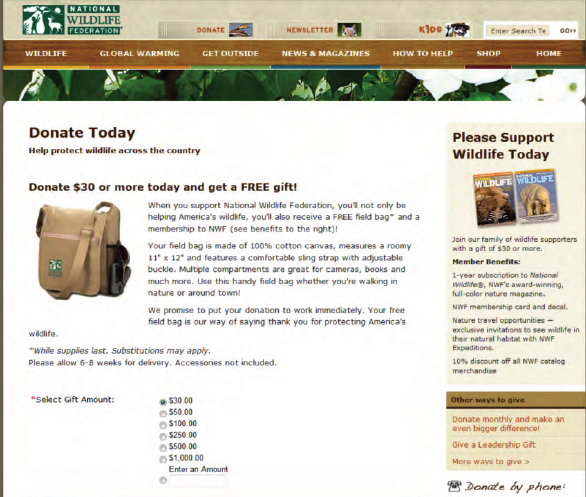
 Are you looking for the magic sauce that will convert your website visitors to donors? With fundraising season just over the horizon, it might be time for you to take a look at your donation page with conversion rates in mind. Otherwise, you could be leaving donations on the table. But what is the recipe?
Convio and Donordigital recently helped seven large US nonprofits test different versions of their donation pages, and shared some of t heir results in a new whitepaper. They were
looking for a set of best practices that could be generalized across organizations. What they found was that the “gold standard” is hard to pin down, but the right combination of form elements for your audience could really make a difference. From the whitepaper: “In our experience, a typical web donation page that has never been tested converts less than 15 percent of the visitors that reach it. Consequently, form optimization remains a tremendous revenue opportunity for many nonprofit organizations at minimal cost.”
They highlighted key strategies you can try in different combinations:
- One or two-column layouts
- One or two-page forms
- Presence and location of trust seals
- Gift amounts horizontal or vertical on the form
- The order of fields in the form
Testing focused on general donation pages, rather than landing pages associated with specific campaigns or emails, and did not attempt to address page copy, graphics and branding, premiums, or other organization-specific elements. In play were the elements that make pages quicker and easier to use, and assure donors of both the organization’s integrity and the site’s security.
Shorter forms generally tested better, as did forms with trust seals (such as Better Business Bureau, Verisign, and Charity Navigator) nearer to the top of the page. In isolation, changes in field order did not appear to matter. The number of columns and layout of the suggested gift amounts sometimes had definite effects, but not always the same effects – here it’s important for your organization to test different versions and let your users tell you what works.
In some cases, the study showed that these sorts of page adjustments could significantly improve conversion rates. So, no sauce, but the good cook’s rule – “Taste!” or this case “Test!” – can mean the difference between turning a visitor into a supporter and having them click away before they give.


COMMENTS