
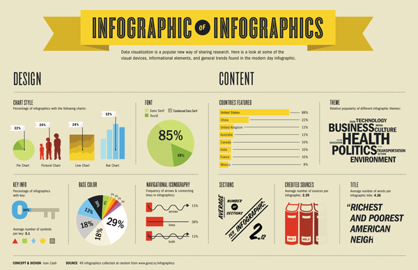
 Infographics are like eye candy. They can be visually stunning to look at while telling an important story framed around data. If done right, they can also be a fantastic marketing tool to reach your target audiences. They are also highly sharable across social media channels. And the press love to cover them too. If your organization is thinking about making an infographic, definitely check out the “Infographic of Infographics” below, which illustrates the most popular elements incorporated into infographics. For example:
- 32% of infographics use bar charts vs. 22% that use pie charts.
- 85% use a sans serif font
- 4.6 words make up the average title. The shorter, the better.
- 88% of infographics feature data from the U.S, 22% from china, and 12% from the UK.


COMMENTS