
 Is your organization embarking on a website redesign in 2014? Here are five design trends to consider.
1. Simpler Navigation to Get Readers to Focus More on Content
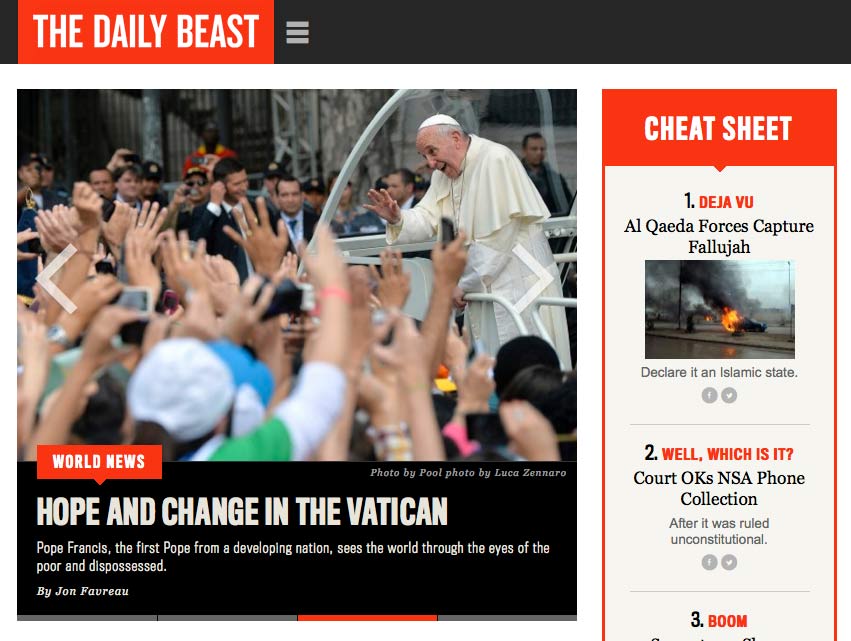
One of the big design trends that is beginning to fade is mega navigation menus that are cluttered and distracting to website visitors. This year we will see more websites with simplified navigation. Designers are taking cues from the way users navigate website menus on smartphones. For example, to get users to focus on reading or skimming the content on a desktop website page, navigation menus will temporarily disappear. To use the navigation, users will see the “hamburger” looking menu bar icon at the top of the screen. The Daily Beast is a good example of this.
2. Bye Bye Sliders?
Organizations have loved sliders for the past few years because it provided an easy way to highlight key priorities for the organization. However, over the years, some data shows it’s only the first slider that generates much clicks. In 2014, sliders will start to be replaced by one prominent photo or graphic with a small amount of text. This is called the hero area or intro area. This design element was clearly adapted from print reports.
While I love the focus on a single element, many designs use enormous photos or graphics, which fills up the entire screen. This is problematic from a UX perspective because it does not give website visitors a preview of other key content on the page. If that first image did not draw users in, visitors will immediately click off the site as users have very low attention spans on the web. These oversized images also require a lot of art direction. If your organization does not have a graphic designer on staff or retainer, this could be hard to maintain and have it look awesome.
3. Scrolling is Normal
I work with a lot of organizations on redesigning their websites at Rad Campaign. The number one request in the design process is that they want to fit everything in “above the fold”. Websites are not print reports or newspapers so remember to not treat them as one. If your websites architecture is solid and the design is clean and has good hierarchy users will scroll with no issue. Don’t fear scrolling. It’s in!
4. Flat Design
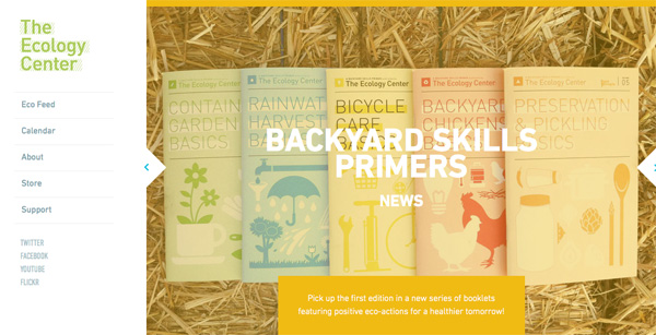
For the last few years, web design has had a lot of focus on drop shadows, gradients, and textures to give design elements a 3D effect. Now web design is headed in the opposite direction focusing more on minimalist design. Design will focus on incorporating more muted colors (though you can certainly use bold colors with flat design), more use of white space for a cleaner look, bold and larger typography (like 16 to 18px for the body text) for readability, and simpler buttons and icons. A good example of flat design is Medium and the Ecology Center.
BTW notice, the Ecology Center’s use of sliders (which move way too quickly) and how some of the large photos they chose, don’t really work with big white text overlaid on top. See how the white text blends into the background? This is why art direction is so important for managing areas that require large photography or graphics.
5. Simpler and More Focused Mobile Sites
In 2013 we saw much more focus on responsive websites, which is a step in the right direction. However, the sites on mobile still replicated the desktop sites from a design and content perspective. Essentially they have been trying to squeeze all of the content and design elements from the desktop version into a small mobile screen. This presents many UX issues for users who are looking at sites on small smartphone screens. In 2014, organizations should expect to see simpler sites on mobile that focus on the most important content you need users to have. Extraneous content and design elements will be hidden on mobile VS desktop. Remember these users are on the go. You must get them info as fast as possible with minimal taps and swipes.
*This article was updated on January 8, 2013

COMMENTS