
 For most organizations, the heart and soul of communications is the email list. Email is the 800 pound gorilla, the elephant in the room, the big kahuna. Email goes direct to the inbox, our online strategy metrics are led by terms like open rate and clickthroughs, and online fundraising campaigns depend on email marketing. Moreover, email is growing and generally has a strong return on investment.
Today, “mobile” is receiving lots of attention. And for good reason. It was recently reported that one in three Americans owns a smartphone. Some sources are indicating that more people will own smartphones than traditional cellphones by 2012. Add tablets into the mix and its clear that people are quickly adopting mobile computing.
As Gary Vaynerchuk put it the other day, you need a mobile strategy by 2012.
I’ll argue, though, that the quickest and most cost-effective place to focus your mobile strategy is your email.
Your email? What? That’s not mobile? Mobile is apps. Right? Angry Birds on your iPhone or getting people to read your Facebook page updates on their phone. Maybe mobile is a version of your website that looks good on mobile devices (which it is to some extent and we’ll get to that below but much or most mobile traffic is coming from your emails).
Five Themes to Focus On
1. Email is moving to mobile devices
One of the first pieces of any change to communications and technology strategy in an organization is explaining the need for change. Simply put, email is increasingly being read on mobile devices and the user experience there is different enough that we need to try different approaches.
As smartphone and tablet use rises, your email follows. Email reading on mobile devices rose 81% from October, 2010, to April, 2011. It stands to continue rising. Today, 16% of email is read on mobile devices while desktops get 36% of messages and webmail 48%.

2) Know where subscribers are reading your email.
Chances are good that you don’t have clear information on which email clients your subscribers are using to read your messages. As of now, this data isn’t commonly available from email providers. Check with your provider. They may be able to dig it up and if this information isn’t available then push for them to add this reporting.
A decent fall-back for this data might be Campaign Monitor’s CSS support report. It breaks down how CSS is supported in different email clients and also what percent of the market various email clients have. We have included these figures below but note that your audience could be significantly different.
|
Outlook 2000 - 2010 |
Apple iPhone/iPad |
Windows Live Hotmail |
Apple Mail 4 |
Yahoo! Mail Beta |
Google Gmail |
Android 2.3 (Gmail) |
Knowing where your emails are read will also let you make data-driven decisions about template design and layout. As the Campaign Monitor CSS report indicates, support for CSS features varies widely across email clients and it is important to know the differences when you’re wondering why your message looks funky in Gmail.
3) Optimize your messages for mobile.
Now that you (might) have an idea of how many subscribers are using which mobile devices to read your messages it’s time to create messages that render well in mobile. This is not too difficult so it’s a bit surprising how infrequently nonprofit email plays nice with mobile.
A Frogloop post back in February shared some good tips for optimizing email for mobile. Check it out but we’ll highlight a few here.
-
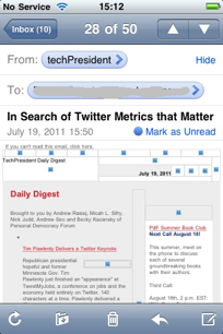
Clear, short and actionable subject lines followed by quick easy to read text with a link (to whatever your action or conversion might be) early on. This is a good argument for minimalistic header images in email. As you know, more and more desktop and webmail email clients default to hiding images from readers. In mobile, images are vigorously suppressed.The screenshot from a recent techPresident message I received on my iPhone shows how having lots of images can become awkward when email is viewed on a small mobile device.
- Include a mobile stylesheet. This is something that can be worked into most email templates but is still not often seen. Check with your provider for assistance or just try it out yourself but if you have any sort of CSS in a template or “wrapper” now then chances are you can add a mobile stylesheet. Campaign Monitor has some detailed explanation of how these work.
- Call to action up front and very clear. People need to see it/read it/have chance to click it without scrolling up/down or left/right. Don’t rely on image-based links as images may not appear on mobile messages. Try to work a call to action text link into the first few lines of your message. Think of mobile email as a screening device for users. If nothing else, you want to make the cut so that the reader comes back to you later in their webmail or desktop. It’s very easy to delete messages received via mobile. Be memorable and don’t get deleted.
- Make sure you have a “view this message on the web” link clearly visible in the preheader (the area at the top just above the message). You may not be able to fully optimize your message for mobile but the web browser version may be easier for mobile users to read and navigate because images and style sheets are better supported.
- Take Google design principles to heart: speed and simplicity matter even more on mobile.
4) Use your email provider’s tools to optimize for mobile. (Or bug your email provider to get on this, as the case may be)
Don’t want to hack code and set up alternate templates and stylesheets all the time? Me neither. So it only makes sense for email providers to do some of the repetitive lifting for you.
MailChimp has good resources for helping you create email-friendly campaigns, including a mobile-friendly email template. It doesn’t make sense to go full-throttle with a mobile template
If your provider doesn’t offer email client testing you have a some good options, including Email on Acid and Litmus.
Explore your email provider’s options, documentation, forums and support staff when it comes to mobile-ready features.
5) The mobile email experience doesn’t stop at the email.
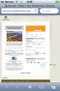 Presumably, you want the user to take action, donate, forward the message, read and comment on a blog post or any one of several other action. You want to convert people and conversion on mobile is hard. In our experience, most action and donate forms don’t play nice on mobile devices. See the donation form below, for example. It works okay on the web but on a mobile device (iPhone in this case) it is pretty much unusable.
This is an area in need of serious attention by some of the main vendors in the space.
Smashing Magazine offers a good primer on designing and building forms for mobile but this is going to be most useful to folks building apps or one-off pages - a time-consuming task to be sure.
Convio offers some guidance on building mobile-friendly donation forms here (note you need to be a logged-in Convio community member). The long and short of it, though, is that the process is arduous and is most applicable to creating a generic, non-campaign specific donation form for mobile users. This approach assumes you know that the user is on mobile when linking to the form, an unlikely situation.
Get your email mobile-savvy and you’re on your way.
Smartphone and tablet use is rapidly growing. The audience is still small relative to your full constituency (though chances are you don’t have data on this for your own organization so track that down). These mobile device users are getting your email and are likely to be the first (and maybe best) targets for your “mobile strategy.” Before getting all worked up about what to do with mobile take a look at making the most of your best asset - email. It’s doable and should have immediate value to your online campaigns. Plus, you’ll learn a lot about your audience and how it uses mobile.
Ted Fickes runs Bright+3, a consulting shop that creates successful digital campaigns for nonprofits and social change advocates.
COMMENTS